Stream Chart
The stream chart is a type of area chart, but rather than plotting the data points along a static x-axis, they are displaced around a varying central baseline.
Each stream is stacked from the middle of the chart, rather than the zero point. The position of the stream is based on the middle value of the largest bar, or curve. Pyramid determines the middle value of the largest peak, and positions the stream along that value.
Stream charts are used to show the changes in the numeric value on the y-axis over time on the x-axis. The width of each stream is proportional to its value.
If you want to see the actual values in the cart, use the tooltip to do so. Otherwise, examine the peaks and troughs and try to pinpoint patterns or outliers in the query.

How to Build a Stream Chart
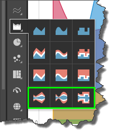
Select the required stream chart type from the Area Chart sub-menu:

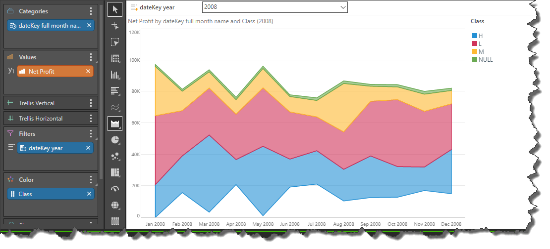
Like area charts, to build a stream chart, you must at add at least 1 measure in the Values zone and 1 hierarchy in the Categories zone. To add a color component, add a second measure to the Color zone.
In this example, the chart shows the changes in net profit over time, for product class:

Spline Stream Chart
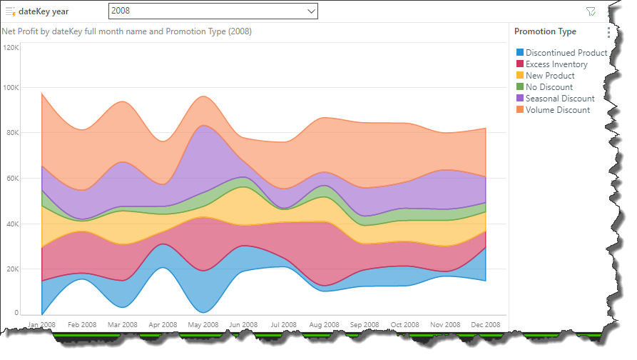
The spline stream chart connects data points with a curved line:

Stepped Stream Chart
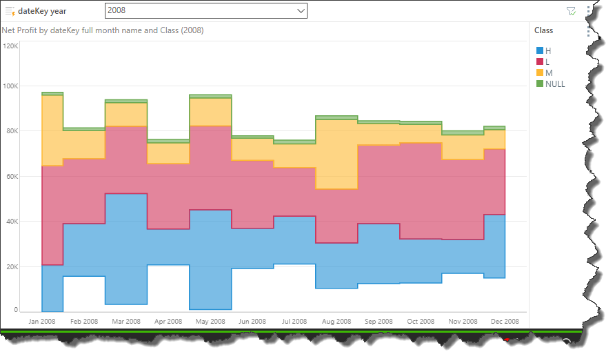
The stepped stream chart connects data points with a series of steps, which can make it easier to read exact values.
